Industry Resilience Predictor
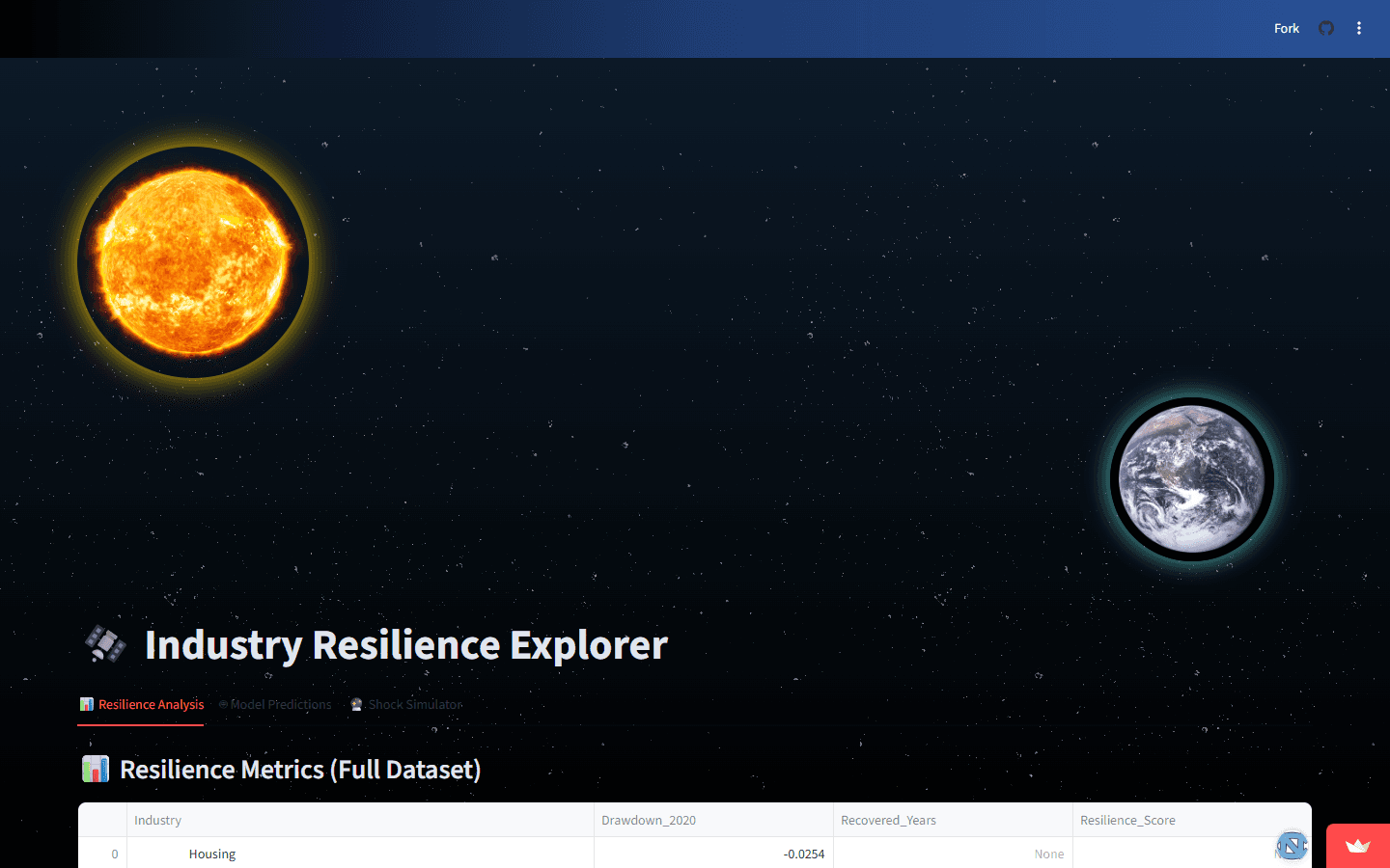
An interactive dashboard and regression model that compare COVID-era drawdown and recovery across 90+ industries. Built during a hackathon.
- 90+ industries compared
What it’s for
This project looks at two parts of COVID-era disruption: how far an industry fell and how it recovered. The dashboard lets people compare those patterns across industries.
How I built it
The pipeline cleans time-series data with pandas and trains a regression model for drawdown and recovery. A Streamlit dashboard makes the industry comparisons interactive, with Docker packaging the project.
What it does
The result is a tool for exploring 90+ industries side by side. People can compare performance through the dashboard instead of working through the underlying data themselves.
The interesting part
The technical work connects raw time-series data to a regression model and an interactive comparison.
Arcade-Style Space Battle
HAVE A QUESTION OR AN IDEA?